HOW TO: Make a rectangle with rounded corners in a PowerApp
October 3, 2017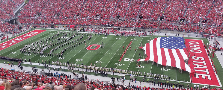
PowerApps Grammar School
October 11, 2017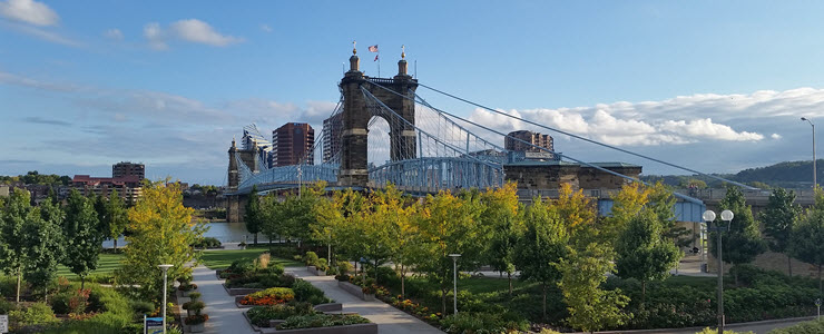
The PowerApps Add Picture control allows you to select pictures from a device’s picture gallery, or take a new picture with the device’s camera and use them in your PowerApp. This post describes how the control handles images with different sizes and crops them. This is helpful information to know as you plan the user interface for PowerApps you create.
To demonstrate the Add Picture control’s behavior I created a simple PowerApp. You can download it here.
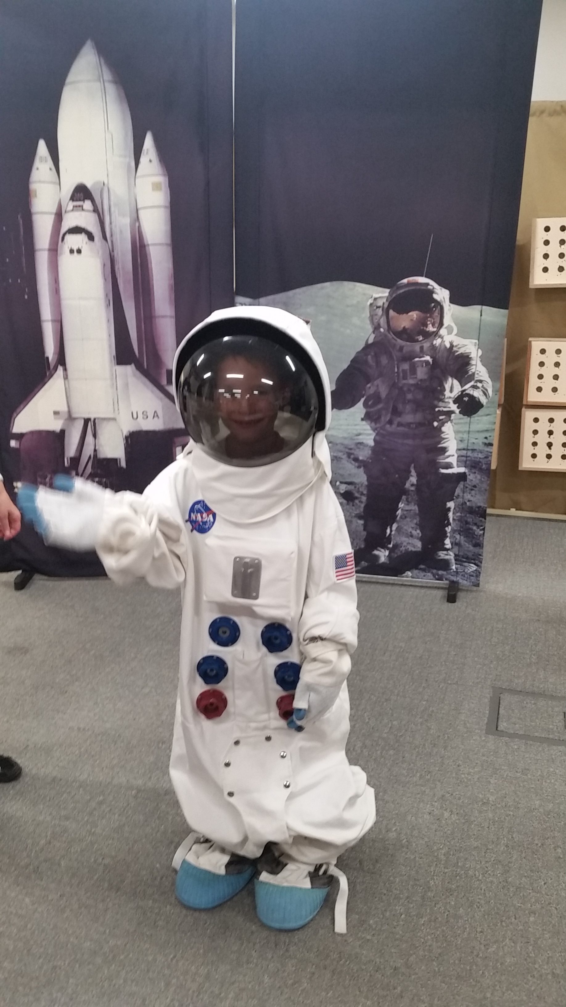
To start, I’m going to use an image I took in portrait orientation with my phone. The image has a native size of 1836(w) x 3264(h) pixels and an aspect ratio of 9 x 16. It looks like this.
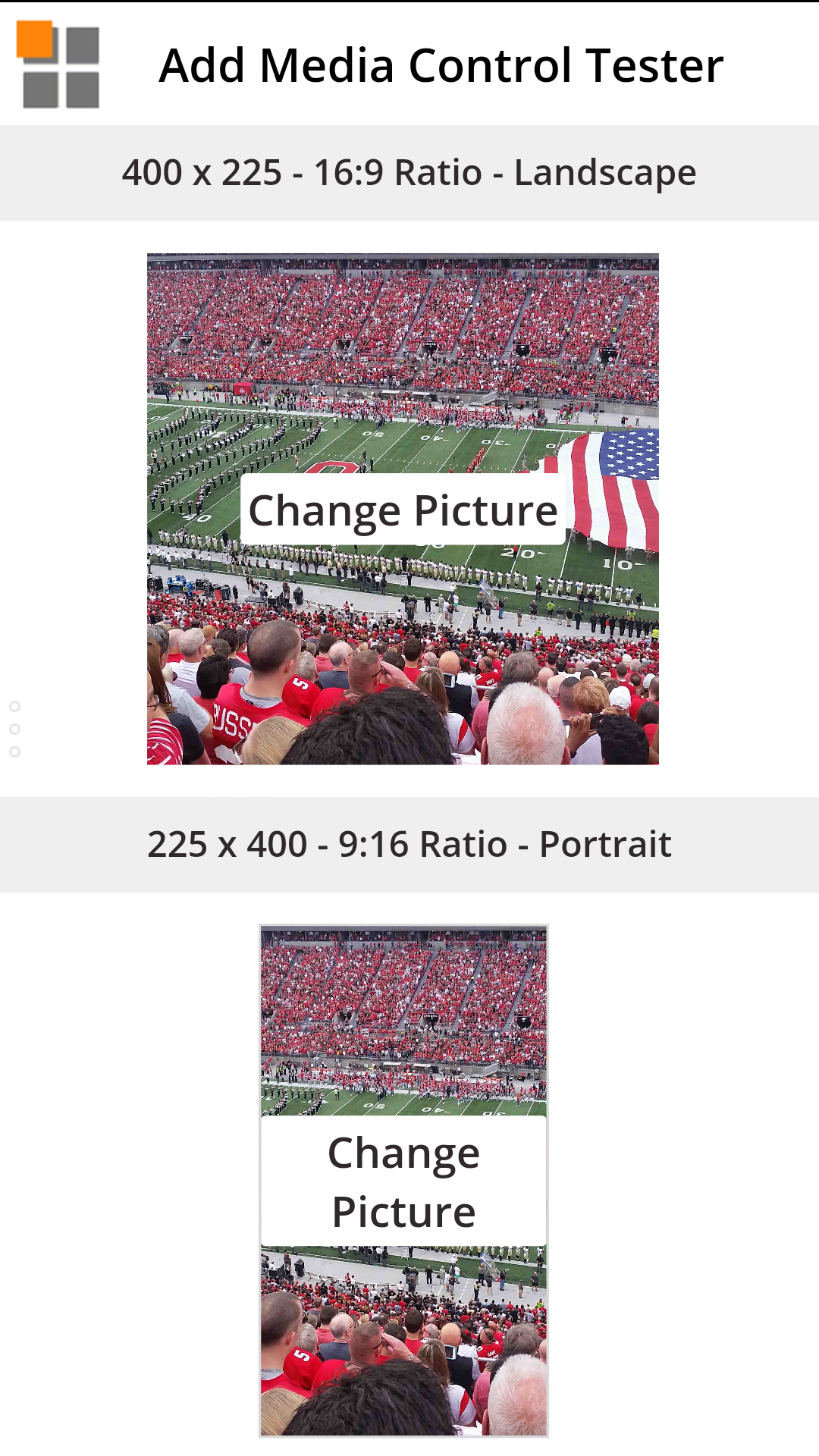
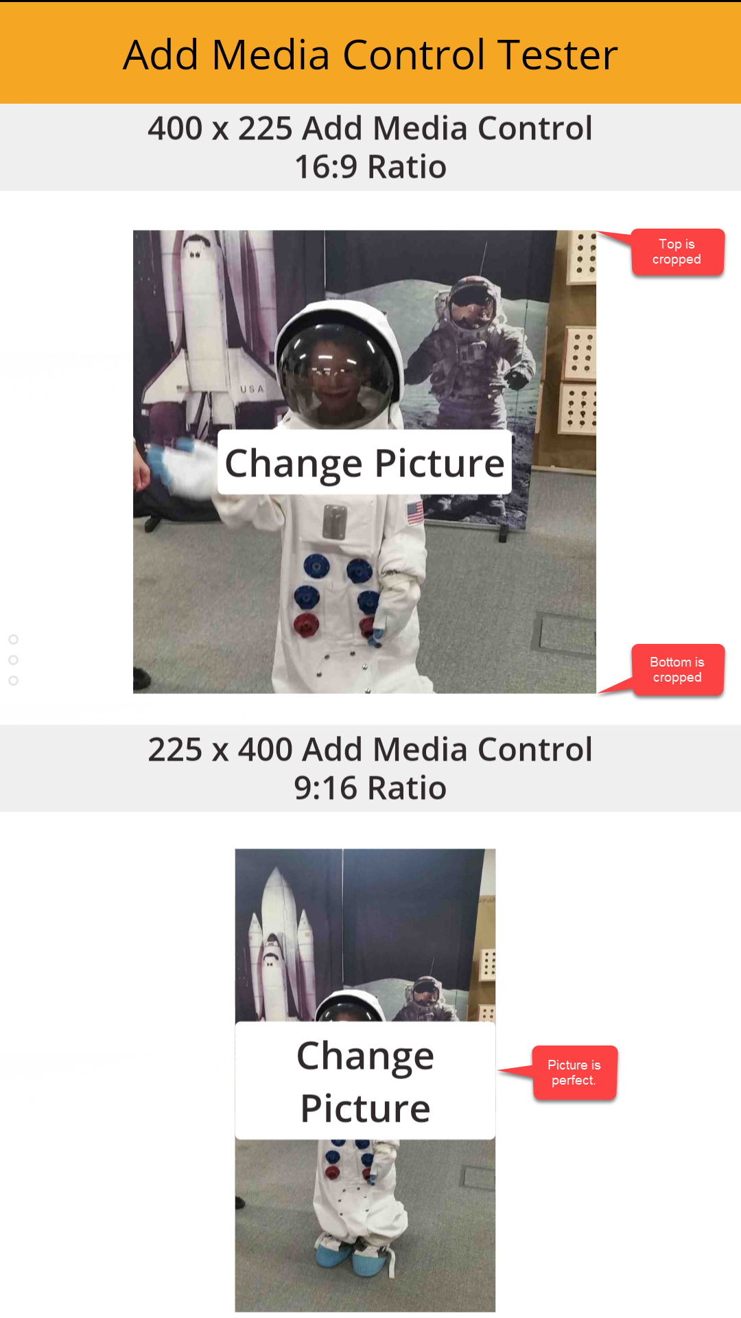
In the screenshot of the PowerApp running on an Android phone below, check out the top picture in an Add Picture control that has a landscape orientation and an aspect ratio of 16:9. The Add Picture control dimensions do not have the same orientation and ratio as the native picture taken with the device. The Image Position property is set to Center. Notice the top and the bottom of the image are cropped.
Also below, notice the bottom picture in an Add Picture control that has a portrait orientation and an aspect ratio of 9:16. The Add Picture control dimensions has the same orientation and ratio as the native picture taken with the device. The Image Position property is set to Fill. Notice the picture is scaled perfectly and no cropping has occurred.
Now let’s take a look at an image I took in landscape orientation with my phone. The image has a native size of 3264(h) x 1836(w) pixels and an aspect ratio of 16 x 9. It looks like this. GO BUCKEYES!

In the screenshot of the PowerApp running on an Android phone below, check out the top picture in an Add Picture control that has a landscape orientation and an aspect ratio of 16:9. The Add Picture control dimensions has the same orientation and ratio as the native picture taken with the device. The Image Position property is set to Center. However, notice the left and right of the image are cropped.
Also below, notice the bottom picture in an Add Picture control that has a portrait orientation and an aspect ratio of 9:16. The Add Picture control dimensions do not have the same orientation and ratio as the native picture taken with the device. The Image Position property is set to Fill. Notice the left and the right of the image are cropped even more.